Saturday 22 January 2011

New Kenny K image


Todays card is one of those that just fell in together without an awful lot of hmming and hahing about colours & papers. Not often I get that happen lol.

The layout is from Sketch Saturday and lent itself beautifully to my new KennyK stamp. I used c1, y21, e53, b93,95 97, rv000 & 95 copics and ivory & blush promarkers to colour her.

Papers are from SU and happen to be my favourite set of all time, Elegant Soiree. I've not got hubbies camera set up right to see the colours properly but I've combined them with Night of Navy & Soft Suede cardstock. SU sentiment and coordinating punch. Wildorchid roses with SU bird & branch punch. And the nesties are my own design with scal.

As much as I'd planned on being a better blogger this year it's going to be difficult for the next couple of months as my selfish idiot of a husband has broke his leg skiing and my time is going to be taken up driving him around so he can at least work to fund my rubber addiction ;o)

Friday 21 January 2011

Birthday card


A bit different colourwise for me today. This one is for my friends soon to be 11yo daughter so I went for brighter colours than I normally use.

Layout is from Friday Sketchers and I've used retired papers & card from SU and the gorgeous Ketto image is coloured with the matching watercolour wonder crayons in retired colours to match the papers. Tempting turquoise, pink pixie, summer sun and only orange. Pretty in Pink ribbon is still a current item though.

Thursday 20 January 2011

Blast from the past


When I saw this Fashionette Lil Lolita 80s Sookie stamp I just had to get her. Leg warmers, ra-ra skirts and big hair.. oh yes that's definitely my era.. bopping about to Human League & Culture Club at discos that strictly speaking I shouldnt have been in ;o)

For her first inking I've gone with a sketch from Dutch Dare challenge blog, a colour scheme (pink, green & brown) from Truly Scrumptious and 1,2,3 recipe from Cute Card Thursday, 3 flowers, 2 papers & one ticket.

I've used f&c ad watercolour pencils in grass green, chromium green opaque, rose carmine, fushia, permanent carmine, indianthrene blue, walnut, burnt umber, medium flesh, and dark naples ochre. Retired stampin up papers, always artichoke, pretty in pink & crumb cake cs. Wild orchid flowers, the small roses are really white but I rolled the edges in artichoke ink before dunking them in water. Whimsy sentiment stamp and a few brads.

The nested shape is one of my own designs and cut with scal on the cricut.

Wednesday 19 January 2011

Another kimmie card


I'm loving these Kimmie images and this one was made for the Spoon Full Of Sugar challenge to make a card in green & blue and Papertake Weeklys challenge to use pearls & ribbons.

Kimmie is coloured with albrecht drurer water colour pencils in juniper, cobalt turquoise, earth green yellowish, chromium green opaque, indianthrene blue, terracotta, walnut brown, cream, gold & medium skintone. To get more depth to the hair I've added walnut distress ink.

Papers are from a retired SU set and I've added a double ribbon bow using variagated green and a narrower pale blue ribbons. A couple of diy hatpins (needles with 2 pearls glued to them) and a few flatback pearls. I'll be adding a sentiment to the bottom left corner as and when I need to use her.

Tuesday 18 January 2011

New stamps


I love my postie when he brings parcels and todays contained 2 Kraftin Kimmie stamps I ordered Sun evening.

Not sure who I'll ever use this Kimmie for but I fell in love with the expression on her face.

I used this weeks sketch from Friday Sketchers and this weeks theme on Cute Card Thursday, monochrome. Thought it might be fun to see if I could use just one colour range of copics then decided to justify her look by using rv10, 12, 14 & 16 with y21 & e37 for her hair, ivory & blush promarkers for skin. C1 adds just a hint of a shadow which I took into the base of the nestie. Sentiment came with the stamp and suits the image perfectly.

Papers are from DCWV rockstar pad and a new eastern Dovecraft pack. Prima flowers, crocheted lace and some cheapie gem flourishes to finish.

Monday 17 January 2011

Sketch & Stash challenge


This is the result from one of the images I coloured today and I was so chuffed with her I decided to use her with the new sketch from Sketch & Stash Challenge blog.

Quite surprisingly this isnt coloured with promarkers of copics, it's water coloured! The hair and dress were first coloured with water colour pencils before adding some depth with distress inks. Delft blue with concord distress ink and burnt umber & walnut with walnut distress ink. The bow and apron are coloured with leaf & apple green pencils.

Paper is Posh Posies from Daisybucket, whitewash co'ordination card put through a bug folder and sanded back with a piece of crocheted lace behind. Rish razelberry cs cut with a scallop nestie and white paper airbrushed (my first try with my new airbrush, woohoo but it's not as easy as it looks on youtube lol) with copic yg11. Leone Em leaf punch and new flowers from wildorchid.

I've got to say I've had a really great day practising water colouring today with my mate Angie. We had a few different types of watercolour paper, distress inks, my SU markers and watercolour crayons and some Albrecht Drurer water colour pencils. I've mentioned a few posts ago about the difference between card and paper but today we trialed watercolour papers. Even knowing how different card and paper react I was really surprised at the differences between the papers. First off we tried the watercolour paper being promoted by Sheena Douglas for Crafters Companion. I'll hold my hands up and admit to always being suspicious of Crafters Companion products as I've never been happy with anything they've put their name to. The watercolour paper didnt change my opinion of them. Fair enough it was reasonably cheap and took a versafine stamped image ok but it was awful to blend with. 2nd paper trialled was a pad of smooth watercolour paper from WHSmiths, much nicer to work with but although easier to blend it was next to impossible to blend away lines after the paint had dried. Not something I've been used to as my bockingford always let me blend away any bloom lines.

Finally I let Angie loose with my Langton grain satine. The image wasnt even totally dry before we were putting on coats and hopping in the car to visit the local art supply shop so she could buy a pad (or 2) lol.

I knew the grain satine was good so I didnt learn anything new about card/paper today but I did find out that distress inks seem to react with the albrecht drurer pencils and leave a depth of colour more reminiscent of copics than watercolours. I'm sure I'll be using the 2 together a lot more in the future.

Sunday 16 January 2011

sickly sweet


Going back a few cards one of my buddies commented that it wasnt like me to do sweet so for Saturdays Challenges theme of With Love I decided to go sickly sweet lol.

For the layout I've used this weeks sketch from Sketch Saturday

Papers from a freebie set of My Minds Eye and DCWV butterfly stack. Baja breeze and cherry cobbler SU cardstock

Whiff of Joy image watercoloured with distress & SU inks and a dash of diamond stickles. Nestie hearts, a few cheap pearls & ribbon.

Can't say as I'm that chuffed with the final card but my youngest loves the candyfloss type colours.

Wednesday 12 January 2011

Book card

After seeing a fabby card in Kozmiks fabby docrafts gallery I decided that it would make a really great project for March playday and could double up as a valentines card for hubby.

I sort of followed a tutorial on Tinas blog but accidentally used the discard pieces rather than the right ones so the book ended up being smaller than it should. That will teach me not to craft late at night when I'm tired but I was just itching to get started lol.

Surprisingly I found it easier to make the inner than I did to decide on how I wanted to decorate it. Papers were easy as I just love using Elegant Soiree from SU and I'd already decided to use the sketch from Friday Sketchers and Saturday Challenges theme of tons of texture.


I water coloured the Magnolia swan using tea dye distress ink on Langton hp water colour paper before adding a small amount of diamond stickles to the feathers. The beak is coloured with scattered straw and dried marigold.

Prima flowers, leone em punched leaves, crocheted lace and a sentiment from papermania. Baza breeze card half embossed with a cuttlebug folder.


The inside is a mixture of the leone emand woodcraft punched leaves, and flowers from wildorchidcrafts. More crocheted lace around the inner box woven with some gold edged cream ribbon. The sentiment was printed before being distressed withold paper. It's from a Clarity stamp but unfortunately the stamp was the wrong size for the oval.


The blue & brown section does open up to reveal my message to hubby and a couple more swans but I'll keep that just between us.

Saturday 8 January 2011

what a difference card makes

This week saw another thread on docrafts forum about stamping & colouring ability or more to the point lack of. So having a pad of my new smooth wc paper (I used to use hubbys bockingford but it's a bit too textured for highly detailed stamps) at hand I thought it might be interesting to show the difference between a really good quality watercolour paper and a really good quality white cardstock.

In the interest of fairness I used the same image, same brush & coloured each image simultaneously. TH distress inks in tumbled glass, walnut stain, tattered rose, victorian velvet & milled lavender. I'll freely admit I'm not that great when it comes to where shadows and highlights belong and I'm just about average at colouring in so if anyone's thinking I can colour better than that I'd probably agree with you lol.


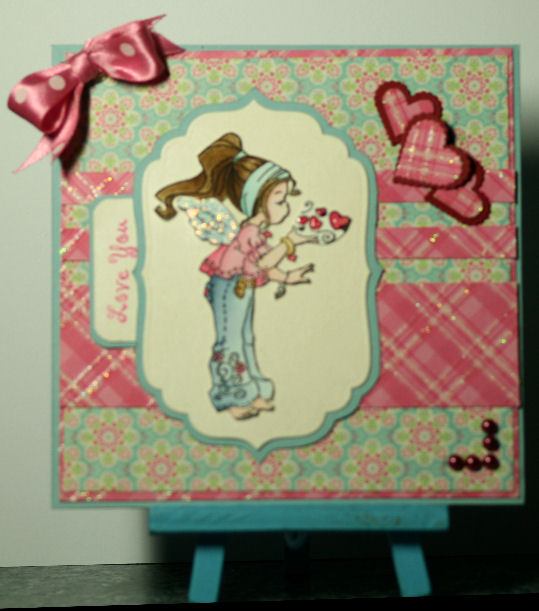
This one is using Annamarie designs 300gsm white card. Pricewise it isnt bad, about £10 for 100 sheets although I got mine on a bogof at a show last year. I use it for most of my base cards and tags. It's my preferred card when using distress inks with blending foam as it really takes ink well.

Watercolouring with it was a different story though. As the brush hit the paper the majority of the paint stuck in one tiny dot and it was incredibly difficult to blend the colour outwards. You can really see this around the arm area where in real life it's quite blotchy. The cheeks were next to impossible to blend in and if you look closely you can see where the card has started to bobble. It does suit how I colour hair (tiny flicks of the brush) but in the main the only way I could blend was to use quite a watered down wash then add in layers of darker colour while still wet. That's not easy if you want to add detail to small areas though.


This is using Langton hot pressed extra smooth graine satine watercolour paper by Daler & Rowney bought from a local artists supply shop. It wasnt cheap, about £7 for 12 sheets of 10*7

Blending with it was a dream and the colour flowed out with the brush. Admittedly I wasnt colouring for long but I was able to go back in and blend over dried areas. This was really noticeable around the cheek area, under normal circumstances I'd have dropped in the velvet while the rose was still wet and blending would have occured pretty much without any help.


This is one of the occasions where my camera has taken a better pic than real life as it's hiding quite a lot of the blotches on the card tilda. Both images side by side which makes it a bit easier to see the difference. The difference of depth of colour is quite striking, the langton is more of an milk white than the pure white of the annamarie. Not sure if that's why there's a difference or not but the annamarie one is quite flat and dull looking around the hair.


I hope if anyone's got to the end of this post that it's going to leave them realising that just buying expensive pens, pencils & markers isnt the only way to get better colouring.. it's changing the paper or card you're colouring on. I'm sat here wishing I'd found the langton paper some 14 years ago when I decided hubbys "cheap" Derwent watercolour pencils were "rubbish" and disliked stamping for another 12 years before spending a fortune on copics, albrecht drurer pencils & polychromos and pinching hubbies bockingford wc paper.

Friday 7 January 2011

Practising colouring again


This time I've been practising colouring with distress inks. Huge enormous thanks to Alex for recommending Daler & Rowneys Langton smooth watercolour paper. Fabby stuff.

I went with a sketch from Truly Scrumptious and their theme of Thinking of Summer. Cute Card Thursday has a challenge to only used old papers. The blue paper is from Paper Salon which I've had for yonks and over stamped with SU Baroque Motifs in Early Espresso. Hard to see with the overstamping but I punched the edge with my SU scallop trim edge punch.

Tilda is coloured with tattered rose, victorian velvet, faded jeans, bundled sage, brushed corduroy, pumice stone and scattered straw.

Tuesday 4 January 2011

Sketch and stash 52


This one is for sketch and stash challenge 52.

I sort of cheated a bit as I wanted to practise my colouring so felt this old sugar nellie stamp would be perfect but I did use some new Old Olive cardstock and some very old k&co papers.

Quite happy with the main image but not so sure that I used the right colours for the cat.

Blame my friend Alex for the long list of copic numbers used, she was showing us blending 3 shades together yesterday so I had a go lol

Promarker ivory & blush for skin.

Copics
bv00, 02, 04, o8, b93, 95, 97, o2, 05, bg01, 05, 10, 15, 23, 35
yg00, 03, 91, 95, y00
e31, 33, 35, 43, 53, 57 w3, 5

Monday 3 January 2011

Oriental cards

First card today is from a sketch on Truly Scrumptious and I've taken the theme from Cute Card Thursday & Papertake Weekly challenge blogs which happens to be ThankYou.


Tilda has been coloured with copics (eek sorry forgot to make a note of which numbers) before being mounted on dovecraft paper. Red & gold background papers are from a docraft set. PB sentiment on white paper sponged with pear pizazz ink. The green background card was shadow stamped with a docrafts oriental flower stamp. Finished off with a mizuhiki knot.


If you're wondering why I've suddenly got a few oriental cards on my blog it isnt because I've suddenly bought new stash more that today was playday and one of my bestest buds Angie luuuurves oriental style so that was the theme for today.

Sort of killed 2 birds with 1 stone as it was my youngests birthday a few days ago and instead of a party/trip to the pictures/meal out she chose for me to cook a Chinese feast. Last one of those I did was for my 21st birthday and it's taken me 22 years to forget just how much prep work is involved!! Anyways back to the card... a fair few years ago one of my all time craft heros Janet Wilson wrote a beautiful book on teabag folding which had a pagoda card that I fell in love with. I decided to recreate the template from memory (sorry if it isnt as nice as the one I remember Janet, Imust get in the loft to find my old craft books) and created a scal pattern. I cut one each for all of my buddies for today but made this card for Tyrias b'day. I went totally ott with silk flowers and added a sentiment in the form of a scroll.


Christmas nearly mojod me out and after a lot of thought (and panic) and many many visits to various galleries and blogs I finally found a quick 2nd project for today at MelStampz The templates are quite a way back and you might find it easier to search for takeout box at scs.

This was the quickie mock up I made late last night. Nowt but a bit of silver pearl card, a few beads, dovecraft papers and a small length of wire. Mine might not be the prettiest of samples but I hope the girls enjoyed making Mels teapot.

Saturday 1 January 2011

Sketch & Stash 51


I don't normally do new year resolutions but this year I'm going to try to be a better blogger.

This one is for Sketch & Stash challenge 51 which let's us chose which of the previous 50 sketches we follow.

I've chosen to use sketch 44 as this suited my new tilda stamp and let me practise tying mizuhiki knots.

Blogger is once again playing silly sods and has decided to rotate the card, grrrrrrrrrrr.

Tilda is coloured with promarker ivory & blush for the skin, copics r32, 37, v12, 15, g00, 02, 28 and c 5, 7. I've used very old washi paper with gold and red pearl card. Black paper with gold oriental script, red organza ribbon. Craft concept bark embossing folder and some metallic green mizuhiki cords. The ovals and signboard shape were cut with scal & cricut.