Friday, 28 October 2011

more dodgy photos lol

Well at least this one is around the right way even if the colours are as murky as the local "stream"

This is a late edition to Sundays playday projects but fits in nicely with the handkerchief card.

I found the project in this months Papercraft Inspiration but Kay found a rather nice project on a blog. Jackies is much nicer than mine though.


Not much to it really, first edition papers, crumb cake 12" card, crumb cake & pretty in pink taffeta ribbon, spray of flowers, retired su sentiment and lots of frayed burlap ink. In real life it's much paler than the pic and the burlap isnt as grungy.

Thursday, 27 October 2011

3rd card in 2 days


I've got no idea why this one is posting sideways. It was taken the right way up, is the right way up on my pc then I upload it! Perhaps it's taken offence at the way the camera flash has affected the colours lol.

This is the 3rd card made in just over 24 hours and if anyone is wondering who lit a fire underneath my rather large rear... Kay did when she reminded me we have 3 birthdays this month! lol

This one is using a Miss Anya stamp, first edition papers, SU card (pool party and calypso coral), a marianne flourish die, memory box flourish die, leone em punch & flowers.

Third card also coloured with copics! I can't say who but someone else is to blame for that as she asked me to try a new card that she's thinking of stocking. Well what could I do but give it a good testing. I'll post in a few weeks with a review and let on who it was but I will let on that the card was enough to reignite my interest in copics and cause me to go spend a fair few pennies on the new ciao shades.... and a few more sketch. Kay spent ages at playday sorting all my pens into numerical order and marking the charts as to which of the storage cases they were in... oops Sorry Kay... not only have I had about 60 of them out without putting them back yet.. when the new ones arrive the system will need doing again ;o)

Anya bday card


Taking photos mid evening in winter is never a good idea but the weather has been foul here today and if I wait for decent light this one would never have seen a camera. In real life it's a very pale mint blue with mink & soft pink papers and I've used a sketch from sketchnstash

Very neglected miss anya stamp with new papers from firstedition. Pool party cardstock, crumb cake taffeta ribbon and a sentiment from SU.

Coloured with copics, predominently g000, 00, 02, R00, 02, 20 & e40s.

ott or what lol


It's one of my bestest mates birthdays next month and I'm always pulling her leg that she puts too much stuff on a card. So in honour of her 80s disco dancing days I had to go ott (for me) with the flowers and glitter lol.

Layout from Sketch Saturday.

Tickled pink image coloured with loads of copics, mainly 0xx ones, (g000, b00, bo2, rv02, rv04 etc).

Papers are retired SU ones, with retired barely banana embossed in a folder and a weeny amount of stickles added to each dot. Tempting turquoise card & the curly cute sentiment are from the current catty. Bling & loads of flowers to finish. She'll prolly say it needs something down the left side and she'll prolly be right lol.

Wednesday, 19 October 2011

No stamping

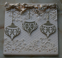
This one is sort of a mix of an idea I had when I saw this snowflake border die and one of Sue Wilsons samples cards on c&c today. Surprisingly it doesnt have a single stamped image! Now that's a phrase I thought I'd never say.. it took me best part of 14 years to teach myself to like stamping, now I have I can't remember not using a stamp of some sort even if it is just a sentiment!!

Photo doesnt show it but I've used a pale cream pearlescent card stock with some gold pearl card. Swiss dots embossing folder on the base layer then top & bottom is diecut with a memory box snowflake border die. The die is truly beautiful, unlike some dies the card pops out as easy as anything and soo delicate (it's a bit of a pain to stick 3d) but, and it's a big but, it was an absolute nightmare to seperate the ends of the flourishy/snowflakey pattern from the waste and the end of the die left a shadow crease which I've hidden with the ribbon. The die preferred to run longways down my bigshot plate and right up against the side. It cut white 300gsm card ok but it didnt go near to cutting some thick (and tough) white double side pearl even with a couple of shims and rolling it back and forwards a few times. Not so sure many people are special enough to warrant me using this die for their card and if they are can I face it again? lol.

The (2) bauble dies are also memory box and they went throught the bigshot beautifully and I'm really chuffed with how they've came out.

Ribbon is one I picked up years ago from one of the ribbon stands at a show.

Tuesday, 27 September 2011

yeovil playday


This is a sneaky peek of my project for the playday we're holding in Yeovil on Oct 30th. Pics arent great thanks to dodgy weather in bristol yesterday so my daylight bulb is glaring on the image.


Card, ink, floral punched strip & script stamp all from SU. whiff of joy image watercoloured, marta stewart patp around the edges.

I do still need to stamp and distress another 4 triangles for the inside but the ink's put away for now and I'll finish off before playday.. prolly the night before lol.

Wednesday, 14 September 2011

flexmarkers 2nd impression

Havent had chance for much more than a small play blending a few of the colours and I have to admit to being sort of impressed. The brush tip is really soft and flexible and was lovely to brush over the paper.

I didnt find they blended quite as quick or as easily as they did on tv but using light dark light method I managed to get aniseed & chartreuse to blend in together very quickly and easily. The blending seems to take a few seconds after the colour has been applied rather than as you're going. Admittedly it wasnt the super smooth transition you get with 4 or 5 different copics, it was a sort of bleed in together more akin to 2 watercolour paint meeting together than a soft gradient, but for quite a light yellowy green and a more bright leaf green it was impressive.

Greens arent a colour I have a lot of in promarkers but the flexmarkers worked well with the grass promarker. It wasnt soo happy with a dark bg96 or g99 copic and I did need to work a bit harder to blend the 2 brands together. I'm more likely to use one or the other brand rather than try to blend the 2 together again but at a pinch it wouldnt bother me if I needed a colour in one that I didnt have in the other and I'd happily use the 2 different brands on the same image.

If I had to make a conclusion on such a short play I would say that diehard expert copic users might find the blending a bit clumsy. For those who arent looking for artist quality colouring or are just starting out you'll love them as they are definitely easier to pick up and start colouring.

What wasnt so impressive was the bleed across the lines but I was using staples 160gsm colour laser printer paper rather than a posh alchi pen specific paper. Up until this new batch of staples paper I had been pleased with it but I have noticed that the very pale skin tone copics are developing an orangey glow. Not good so I've gone over to neenah which I wasnt impressed with before compared to my old favourite mondi brand laser paper. Oh well, will try the flexmarkers on neenah and bristol board tomorrow and report back.

Being honest even though I love alchie pens I think I'll always find watercolouring, either from pencils, crayons, inkpads or my SU markers, a lot quicker and easier. It's not going to stop me buying more copics and flexmarkers. Perhaps if I win the lottery I'll try some shinhans as well lol.

New Flexmarkers have arrived

Ok I'll admit I'm a colour junkie, I'm totally addicted to inkpads, inks, pencils, paints & markers. The newest addition has just arrived, 4 sets of flexmarkers. Now I'm not a huge fan of promarkers, love the colours but not the nibs, but the new pens have got a brush marker tip so I couldn't resist.

First thoughts are that I like how the colours have been selected as they seem to each have a natural shading match. I'm also quite impressed with the plastic packaging.. normally it's grab the scissors and fight to get in to the goodies but these are in a clamshell packaging which just popped open and can be closed again. Pens are held in their own nicely fitting chanel so the pens don't *need* their own special storage. Please note I said *need*, that's different to want and chances are if I like them I'll be storing them in a wallet similar to the ones I keep my copics in. For the moment my purse has to remain closed tho.. sneaky peak SU order has more or less wiped me out but it was sooo worth it lol.

Anyways enough about storage & packaging and let's get to the good stuff.. the pens! Unlike normal promarkers these have got a wee coloured circle on both lids so seeing which is which is going to be dead easy no matter which storage is used. On the downside though the lids are the same both end so there's no quick easy way to tell which end is which. Going to be a little bit of an annoyance but hey ho copics get on my nerves when I get them round the wrong way but it hasnt stopped my buying or using them lol.

Crikey these lids are bloomin hard to pull off, can see this being a problem for those who havent a lot of strength in their hands. Ah first problem, colour on the brush end of tea rose is decidedly different to the chunky end and is coming out as more solvent and little pigment. Water melon is ok though, so going to try the rest. Back, tea rose has dried to the same shade but lemon chiffon, honey dew and aquamarine havent. I have read about this problem and the solution seems to be to keep using them and it will sort itself out. I have found another problem (I've read about it happening to other people as well) and that's a duplication of soft mauve and I'm missing a pink lavender. Oh well, will email Joanna Sheen and let her know it's not just the c&c packs that have duplication problems. Will ring letraset in the morning as apparently they're sending out single pens, unfortunately the 2nd soft mauve has a cracked barrel so it's not even worth hoping they'll let me keep it lol.

My palms are now hurting from taking 48 caps off! So I'm going to give it a break while I have a cuppa then I'll have a go at colouring with them and see if I can get the lemon chiffon, aquamarine & honey dew to play nicely.

BTW I've already made a colour chart for them, it's split into 4 boxes just a tad under 15 * 10 cms ready to fit a tag in my flipflop album and has all the set 1 - 4 colours as well as the flexmarker shades that arent available in promarkers. If anyone wants the pdf just email me and I'll send one over. Please don't leave your email addy in the comment section as although I'm sure I only get nice visitors you never know. bbl

Monday, 15 August 2011

Next months project


For those who didnt see it this is the project for Septembers playday, an advent calender. It's roughly 6" cubed and when finished will have an easel card on the top.

Takes a whopping amount of card to make, at least 20 a4 sheets of base card and some scraps to decorate. I've used the waste from last years xmas cards (marina mist card stock, see it pays to save the bits lol).

Images are from the delightful decorations and contempo xmas stamp sets and stamped with marina mist on to whisper white before using the coordinating bauble punch. Numbers are from a retired spellbinders die and before anyone asks no I'm not bloomin diecutting any more... you can all do your own :op There were times when I was cutting all the 1s that I thought I was loosing the will to live!! For one time only peeloffs will be permitted at playday ;o)

Friday, 12 August 2011

I was right lol


I knew I'd end up cannabalising the card I wasnt happy with a few days ago and I was right to do so, well I think so.

I very carefully took the card apart and cut the castle & pots away using a sharp scalpel. The mermaid thankfully came away without any damage. The base is a stair card which I cut with scal from lilac and white card. The white was distressed with bundled sage and tumbled glass ink before stamping the lavinia fronds randomly around the edges. LOTV sentiment punched out with a SU circle punch and matted with the scalloped circle punch. The lil fish charm has had a thread sewn with some crystal beads before being attached to a sparkly ribbon bow. The card is for our youngest (and best behaved) member at the monthly playday who celebrates her birthday later this month.

Fun in the sun


The theme this week on Kenny K's Krafty Girlz challenge in fun in the sun and this was just the nudge I needed into using this fabby icecream girl image.

I've used copics to colour her and she's matted on to one of my shapes cut with scal. Background papers are from dcwv, either dressed up or rockstar. The pic doesnt show it but there's loads of silver & glitter in the paper. The narrow trellis band is a deep lattice punch from martha stewart which has had the scallops sliced off. Sentiment & matching scallop square punch from SU. Wild orchid flowers, 2 crystal hat pins from creative expressions although I have pinflair glue gelled some beads to the bottom of the pins to hide the point.

Wednesday, 10 August 2011

One of those cards


After having one of those cards that just comes together sooo well I should have known the next one would be a total disaster.

I bought some new stamps from chocolate baroque and decided I wanted to make an aperature and back it with some caught in crystal acetate. Acetate made, check looked good. Stamped and aperature cut, add a watercolour wash.. check. So far so good and everything was working well... so stuck it all down and in a moments madness decided I wanted to darken the wash. Just one of those moments that you wish you'd stuck to the knowing it was enough, wash was too dark for the caught in crystal so off comes the acetate, grrrrrrrrrr. Next bright idea... stick some of the black pearl underneath instead but add a wavy embossed pattern. Looked ok so I stuck it down well with tombow. Then realised the oval is too big to carry a dark inner and the wash is looking a bit plain. Add in some starfish and shells... still needs something.. I know weeds hanging down.. now where did I put those stamps?? Havent got the foggiest where the weed stamps went to so I was left having to use Lavinia hanging vines.. too late to stamp directly on the card so I had to stamp them on seperate watercolour paper and cut them with a scalpel! Add in some peeloff borders and it's STILL missing something lol. Hopefully someone at playday will have some tiny fish stamps ;o) I'm not happy with it so don't be surprised if it gets butchered and appears as something else lol.

Wash, background, shells & starfish painted with distress & su inks. Mermaid painted with cosmic shimmer drawing ink although used tattered rose distress ink for skin. Hints of daler & rowney shimmery blueacrylic artists ink (interference rather than solid colour) with bubbles made with crystal effects.

Friday, 29 July 2011

playing with browns

Bit of a hodgepodge of reasons for this one.. hubby had a clear out a few days ago and there were 3 fabby cream brocade buttons that just had to be snipped off before the waistcoat went to the recycling. Those ribbons got me thinking.. I've never done an image card in nothing but my favourite brown tones so there was 2 things I wanted to do with it. Then on KennyKs challenge blog the theme is pocket cards and I havent really done one of those either. Next came a thread on one of the forums about feeling guilty about buying stash.. well I'd just sorted out my markers and had a pang of guilt of having a full set of polychromos that have been used so rarely I've not even needed to sharpen the flesh tones. So here we have it.

Kenny K image coloured with just about every brown, yellow ochres and orange polychromo there is. My own nested shape cut with scal, vanilla grosgrain ribbon and ornament stamp & retired papers from SU. MS & SU punches, and flowers from wild orchid.

I'm entering this one in to

Kenny K Crafty Girlz
- pocket card
Truly Scrumptious - buttons and bows
Totally Gorjuss - punches or dies
DYSU Challenge - yellow, orange and brown
PixiedustChallenge - monochromatic card in favourite colour.
paperpretties - no markers

pinkink 2

I thought I was cutting it dead fine or a tad too late with this one for the pinkink sketch challenge. Then I looked again and they're a fortnightly challenge so I could have spent a few minutes longer getting it just right (d'oh lol)

Rockstar papers, su & ms punches, su sentiment and music note wheel, perfect pearls, wild orchid flowers and the tilda I started to colour on my copics versus spectrum noir pens post.

She's coloured with copics, with bg & yg shades.

Wednesday, 27 July 2011

spectrum noir versus copics

I decided in the fairness of testing the spectrum noirs against the copics I'd weight things in favour of the spectrum noirs just in case my dislike of crafters companion was influencing me. To weight things I restricted myself to bg01, bg05 and bg09, all in the same blending family but the 3 most extreme to blend together. I already know that bg01 is going to be a lot darker than the spectrum noir 171 or 178 and I'll get less of a highlight. In normal usage (and if I had them all lol) I'd have used a bg000, bg02, bg05, bg07 & bg09 to get maximum shading.

This time I'm using stampinups whisper white paper and because I coloured side by side it allowed the ink to totally dry between shades. Not a single bit of bloom so I'm a lot happier with the results.

Technique wise I went with more of a flick motion and along the lines of the flick hair video on colour me copic blog.

On the left is the spectrum noir in 178 and the right is the copic bg01


The pic hasnt shown it very well but I added some 171 to get a more graduated effect before adding some 68 midtones then some 65 for the darkest shadow. I've used bg05 for the copic midtone and bg09 for the darkest. I havent attempted any blending, just laying down the colour.


I've used the midtones to blend the darker shades, both images show just how large a difference there is between the mid & lighter colours.


This time I've gone back over with the lighter colours to blend mid to light.

In real life there is still more blending to do and it needs more dark on both images.


The spectrum image has been gone over twice more with dark, medium & light and I had to use a lot more ink/blending strokes whereas the copic only needed a few more light touches.

It could be my imagination but the lighter spectrum colours seem to bleach out the darker colours more than copics do.

I'd probably use either image if I'd paid more attention to proper highlight placements.

Will I buy more spectrum noirs? Nope, not unless I've had a chance to play with other colours and find the colours blend more naturally.

Spectrum noir 2nd impressions

First testing finished. I did try using light medium, light, dark, medium, light method but that was sooo bad I have up and went to dark medium light blending.


Photo is better than the real life image where the difference between the light and medium shade is extremely harsh, specially on the arm and hat. I wouldnt use this image even if the ink hadnt have bloomed.


Using 65


Adding in 65 and blending over about 1/3rd of the darker shade.


Added in 171 , again blending over about 1/3rd before adding some more 65 and blending that in to the 68 again. You can really see the harsh lines between the 171 & 65.


I've gone back over again and tried harder to blend the 3 shades together. The ink seems a lot juicier than my copics and promarkers and even on neenah and leaving a minute or 2 between colours you can see where the colour is blooming across the edges.


2nd impression... not impressed. These pens are being marketed as easier to blend as they've been put in to blending families but if I had to make a recommendation I would say to add a shade in between 171 and 65 as there's just far too big a difference between light and medium. It's probably the same as using a bg11 copic with a bg15. With a lot of practise they're probably going to be ok but these arent pens for those with the attention span of a gnat (me sometimes lol) and those that expect to pick up a pen and turn instantly into a virtuoso artist.

Will practise some more... back later lol.

spectrum noir first impressions

First thought was ooh these are chunkier than I thought they'd be. They're even chunkier than the promarkers and feel quite uncomfortable in my small but really pudgy hand, not just because they're larger but being square they dont sit as well. Pen thickness is a personal thing though so I'm not going to mark them down for that.

Nice to have a pen that doesnt roll off the desk though. Nib wise the nibs are not far different in size to the promarkers.


The colours on the pen lids don't appear to go together. I did a first test swatch and it could be my eyes but I would say there are 2 distinct colour tones, one being more of a greeny sea turquoise the other a petrol blue turquoise.

There are light, mid and dark tones in each trio although at first glance it's hard to see which light shade goes with which colour way, looks very much as though you could get away with both as 178 is decidely lighter than 171.

I've got no gripes or whinges about the coverage and once the ink is down I don't think anyone would ever know which brand of pen had been used.


For those used to copics way of numbering (letter denotes colour family, first number the tone and the next numbers the strength of colour with 0 being the lightest) the numbering system on the spectrum noirs is going to drive you loopy. There seens to be no obvious pattern to the numbering. Like copic sketch the number being onthe lid will be handy when hunting in a case but not so great for those who want to keep them in a drawer.

Off now to do a real test with a couple of stamped images.. now which stamp shall I chose lol.

crafters companion spectrum noir pens

There's been a slight buzz in a couple of uk forums about the launch of new alchie pens from crafters companion. Same sort of pens as copics and promarkers but a lot cheaper and they will be refillable although at the time of writing this there's no idea about how much or when the refills will be available. As we speak I've got a set of turquoise pens winging their way to me. As soon as they're in my grubby mitts I'll do a side by side test.

Now I'll admit to being dubious about them, not because I'm a copic girl at heart but because everything I've ever bought with crafters companion logos has been poor quality or badly thought out. Just a few bad buys have been

ultimate embossing gizmo, flimsy cheap construction that's had issues with hinges and the ruler. The cutter is worse than an old rusty stanley knife. The embossing channels are too chunky which leaves misaligned gatefolds and leading edges.

Sticknspray, marketed for coating the back of ums and claims made that it could be enough to hold the stamp up to 60 times... I was lucky if it held a 2nd. Claims were also made that it would hold posters.. nope doesnt do that for me either.

watercolour paper.. claims on tv about how good is was for blending watercolours. Came last when I tested it against other watercolour papers. Even the cheapest of the cheap from whsmiths was better.

cds, first flower fairy cd was horrendous, pictures printed pixellated and the fairys all looked as though they needed a razor up and down their legs. Later cds have had misaligned images and missing files. As we speak several months on and a patch for the fairyopolis cd still hasnt been sent to people waiting.

There have also been complaints about their trimmer not being very accurate or easy to use but I havent tried it myself.

Anyways I'm off to stalk the postbox.. hopefully the postie will be here soon and I'll post back what I think of them.

Friday, 22 July 2011

blue green xmas


Not sure about this one, I've combined paper salon papers with SU baja breeze card stock stamped with a snowflake and embossed in white.

Baja breeze seam binding, sentiment from perfect punches set and wild orchid flowers mixed with branches from the SU bird punch and some stickles. All of the papers have been distressed along edges and matted on some deep brown pearl card which again has been distressed.

The sugar nellie (after getting Clint the Cowboy as a whimsy stamp last week when in fact he's a kraftin kimmie leads me to believe my memory isn't what it was lol) which I've had for yonks is stamped on neenah and coloured with bv0's & bg10's with touches of e30's and e0's.

Layout is from sketchnstash challenge blog
and the theme is winter blues from Sweetstamps Blog

Friday, 15 July 2011

New challenge blog


Not sure how I found it but Pink(ink) Sketch Challenges started off this week and I had to have a play with their first ever challenge.

Sadly the card is a bit too blingy to get a decent photo but in real life it's quite subtle even though there's lots of metallic silver and glitter.

Image is from CC designs and it's her first inking. I've used wow silver tinsel ep and watercoloured her with pretty in pink, bashful blue and so saffron markers from SU with a medium flesh watercolour pencil. There is a hint of perfect pearls painted on to the showflake skirt.

Backing papers are a mixture, the snowflake rows is from a dcwv pad but the other 2 are using stamps, powders, bashful blue & pretty in pink ink & cutndry pads on white card.

Diecut snowflakes from glitter card, some pastel glitter mizhuhiki cords, sentiment & punch from SU. Everything is backed with elegant eggplant card stock.